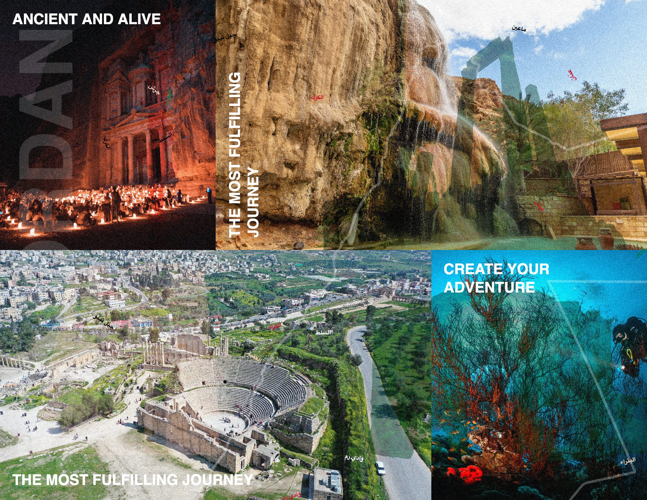
GENERATIVE IDENTITY
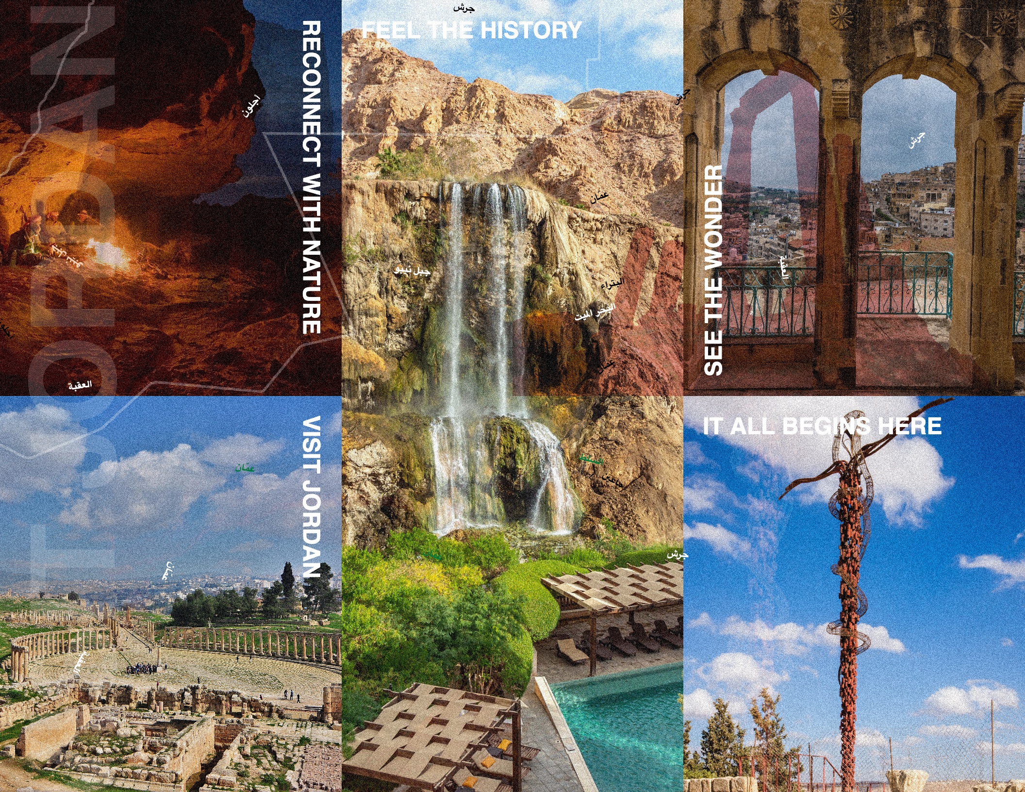
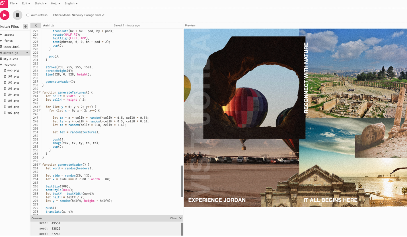
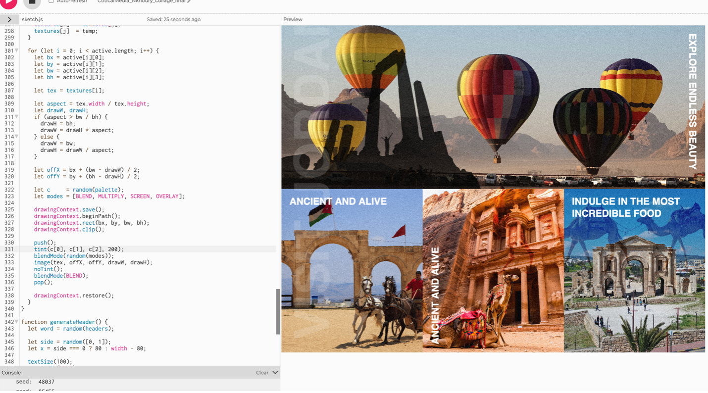
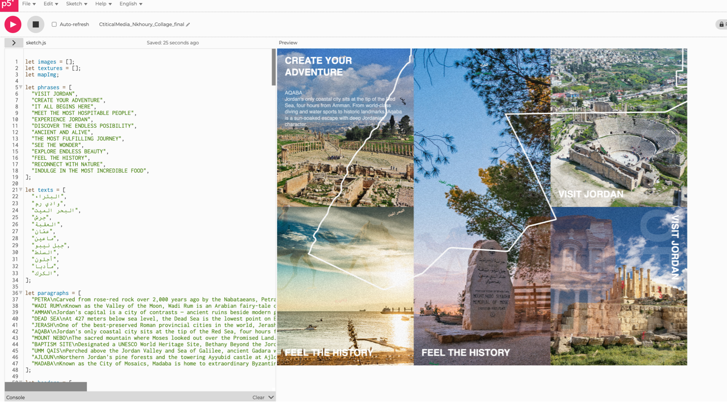
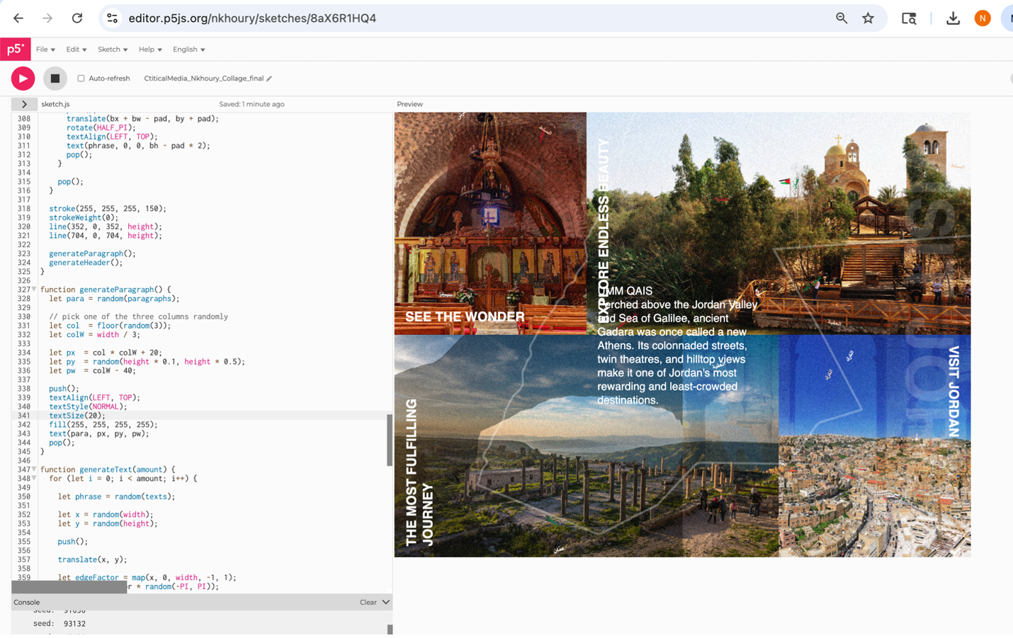
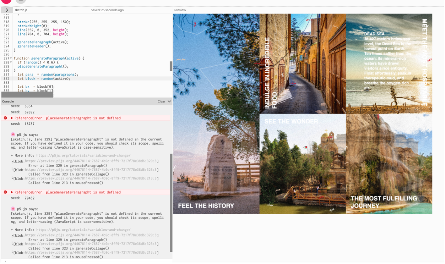
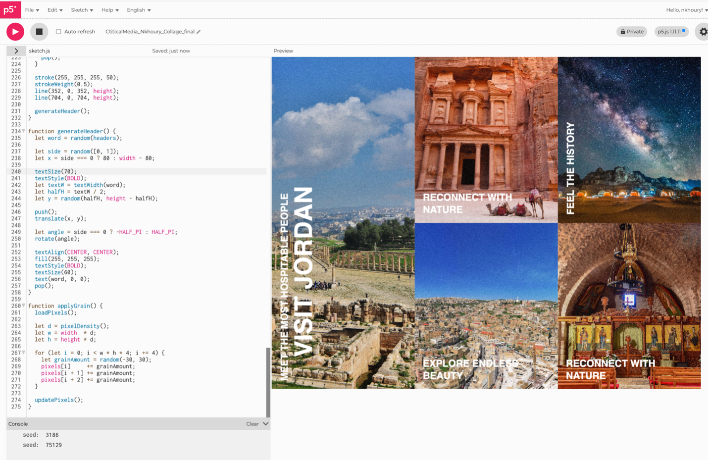
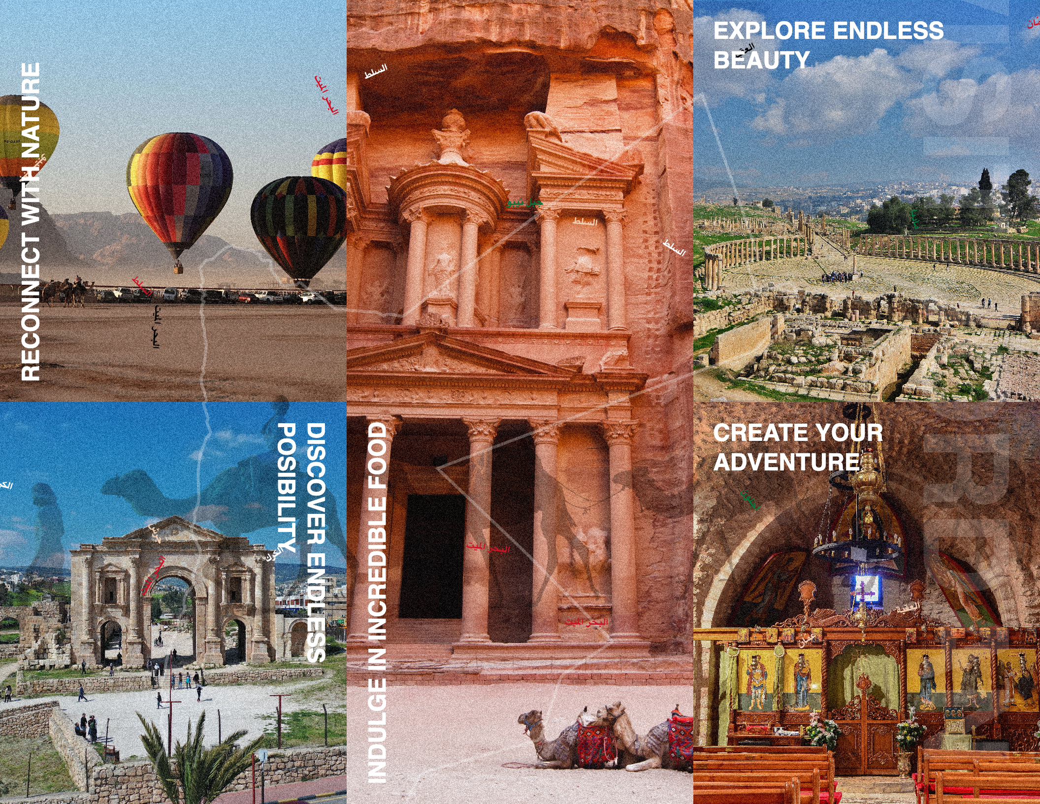
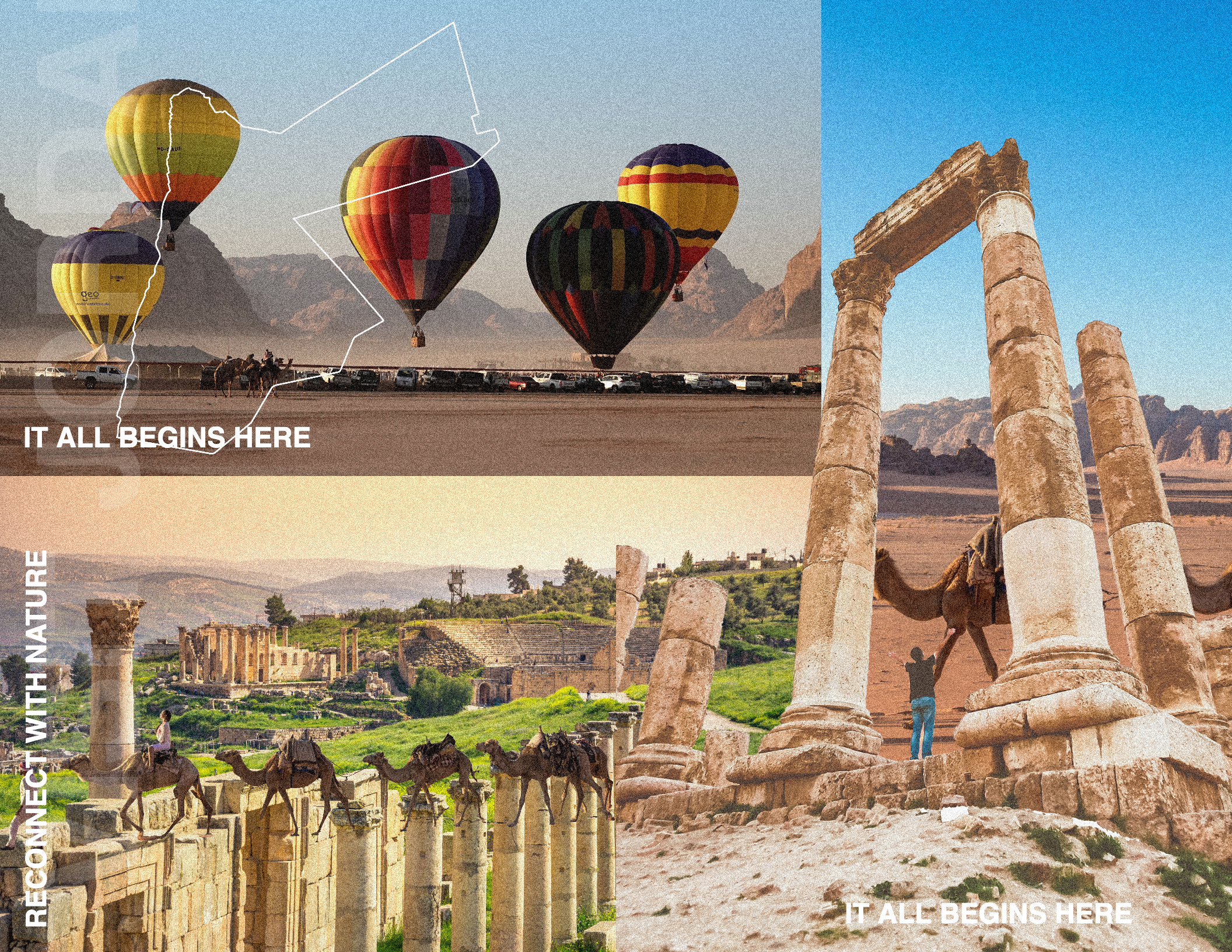
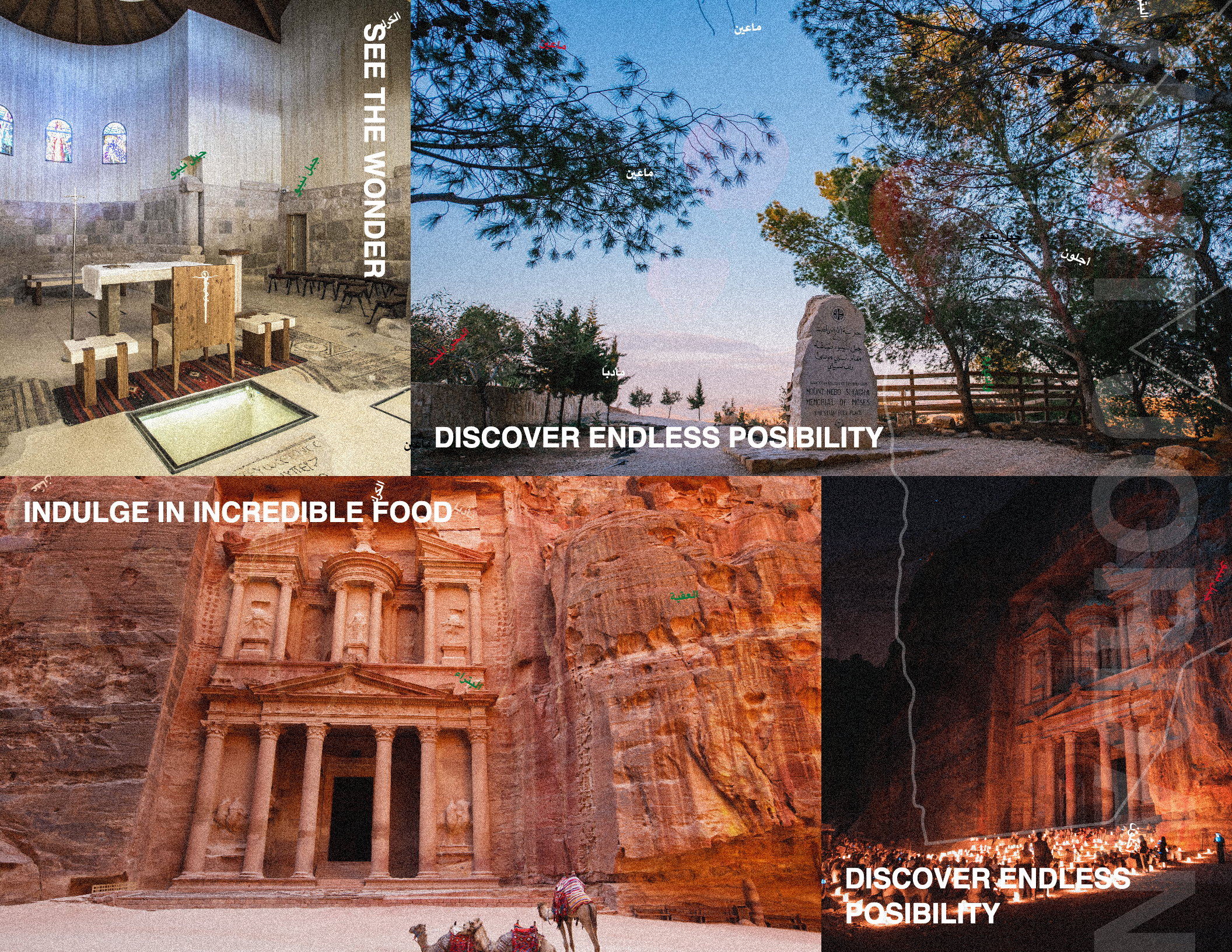
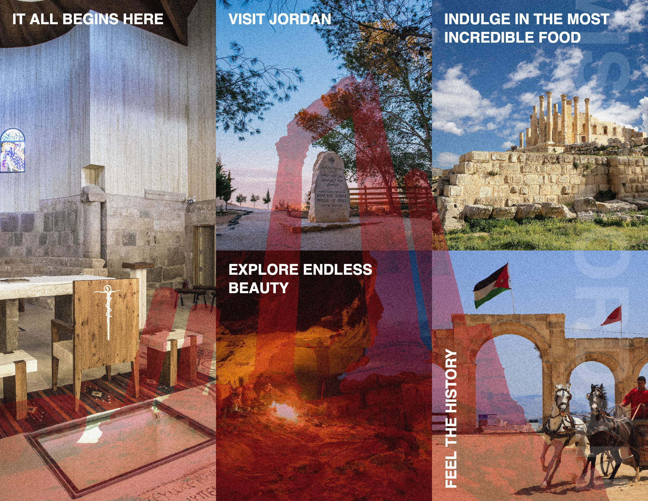
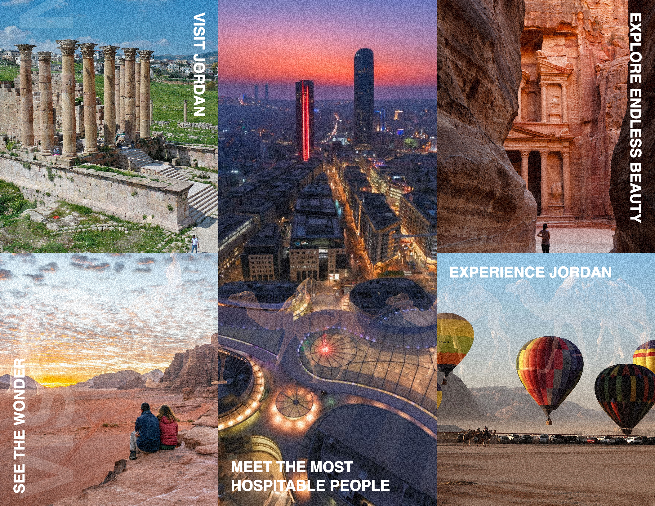
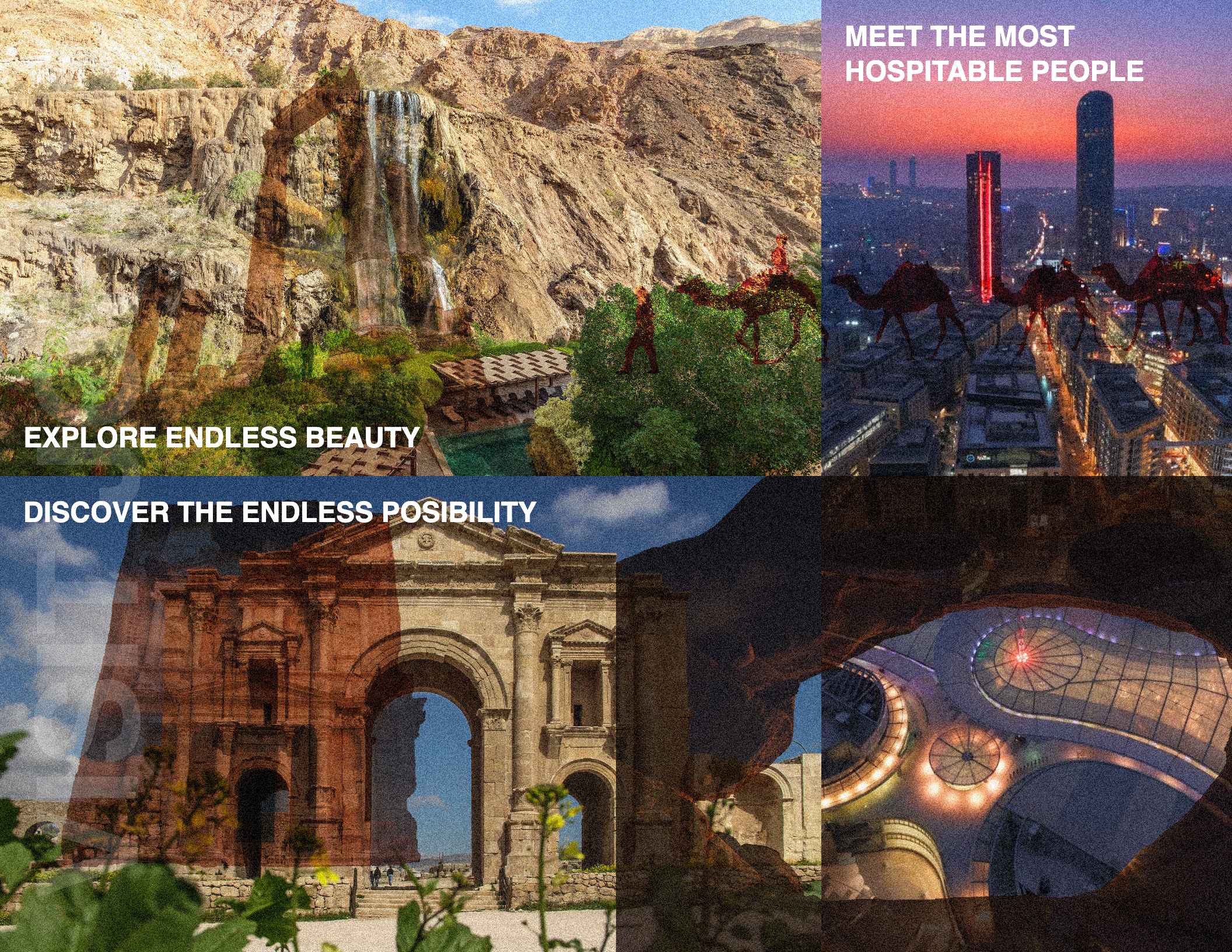
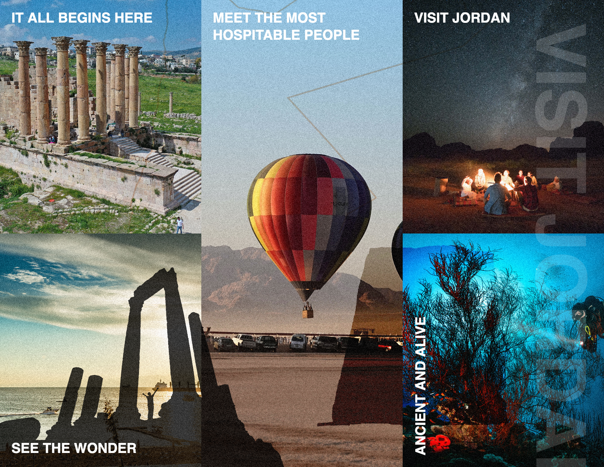
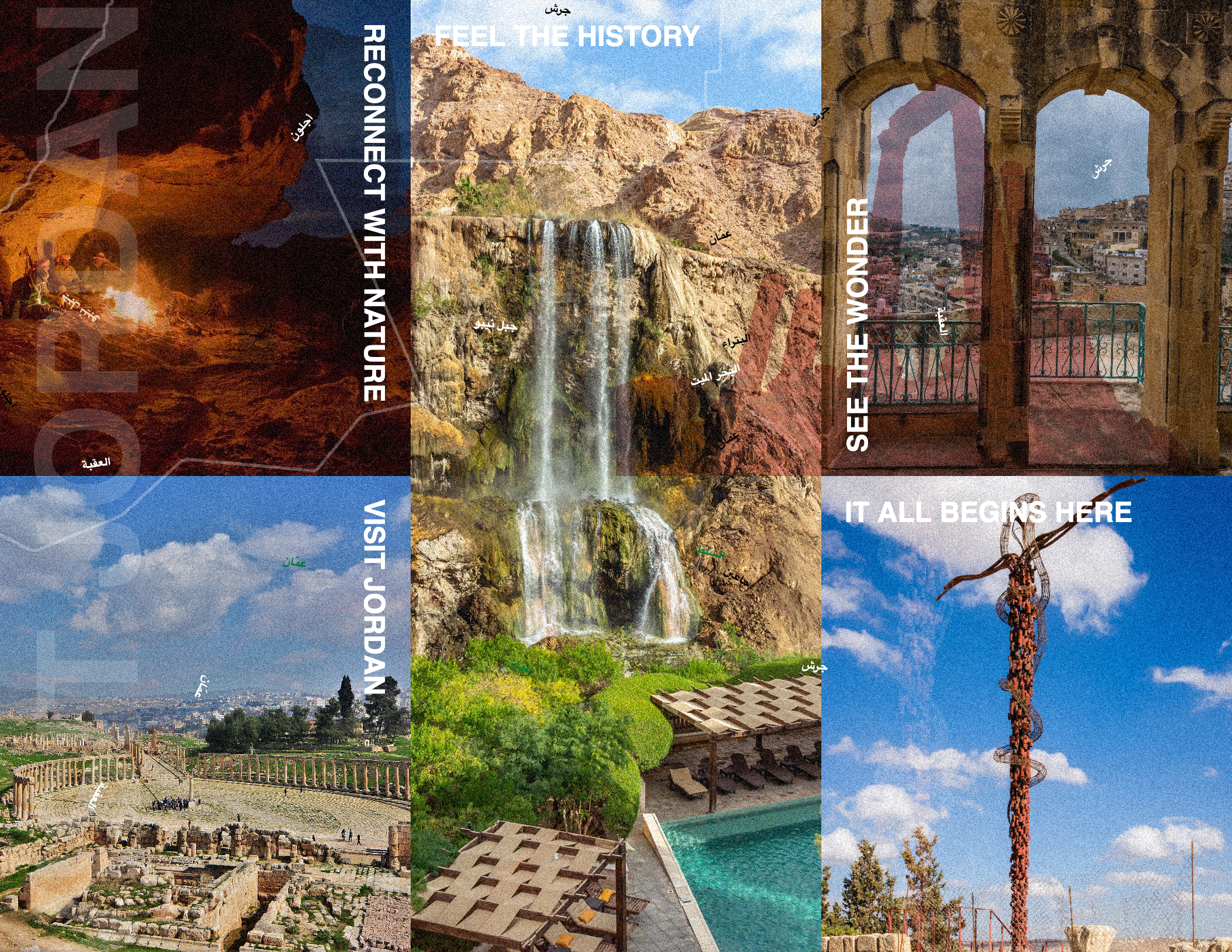
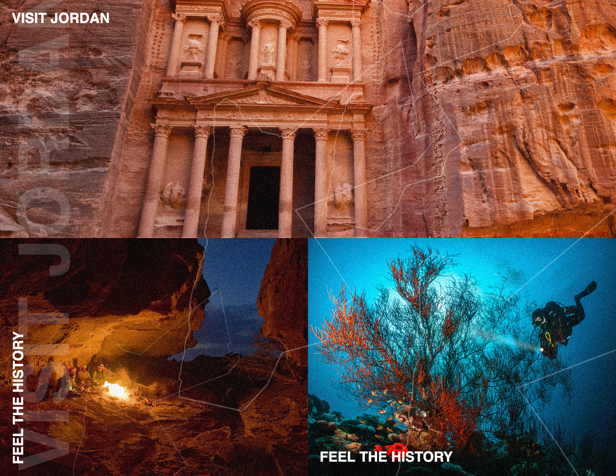
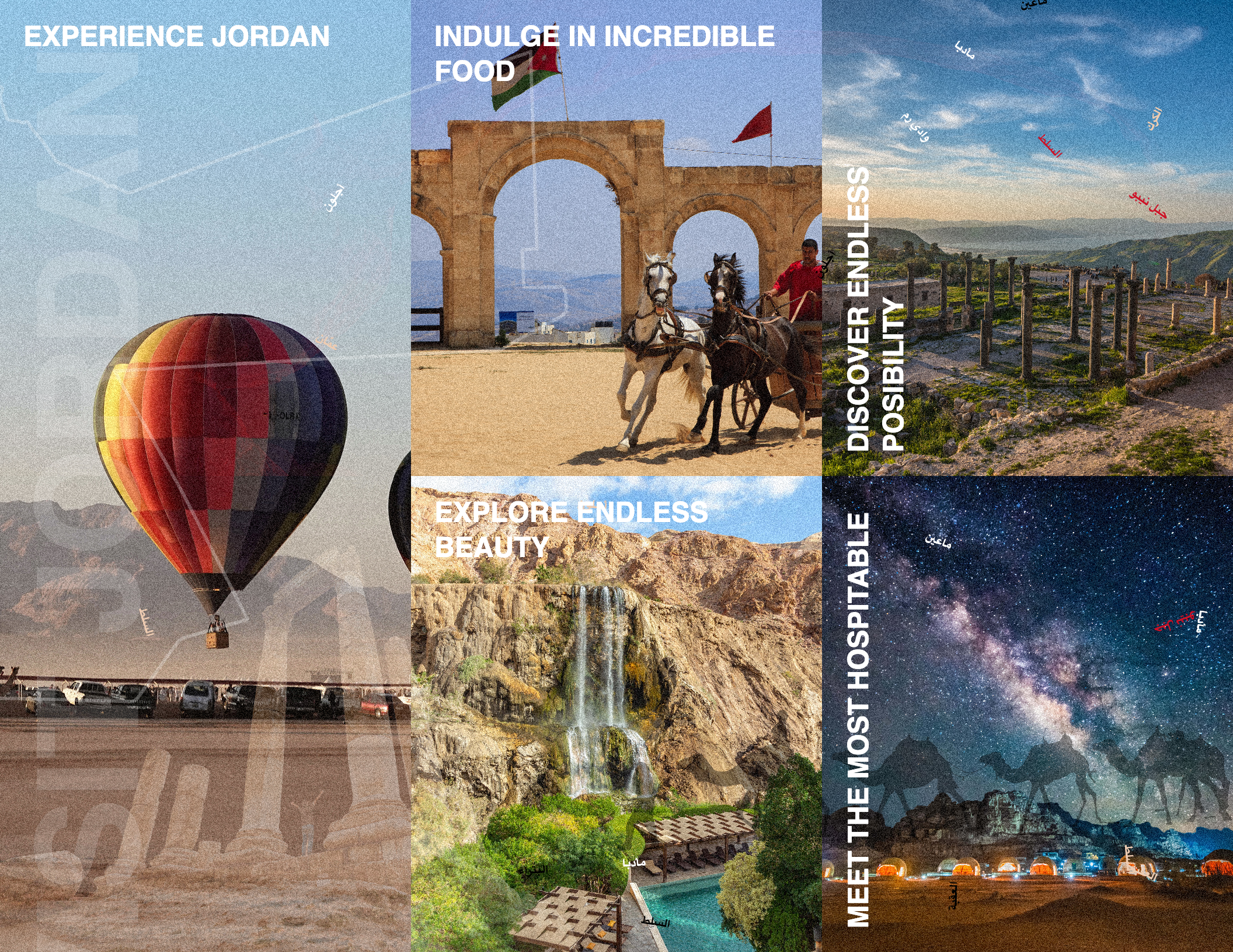
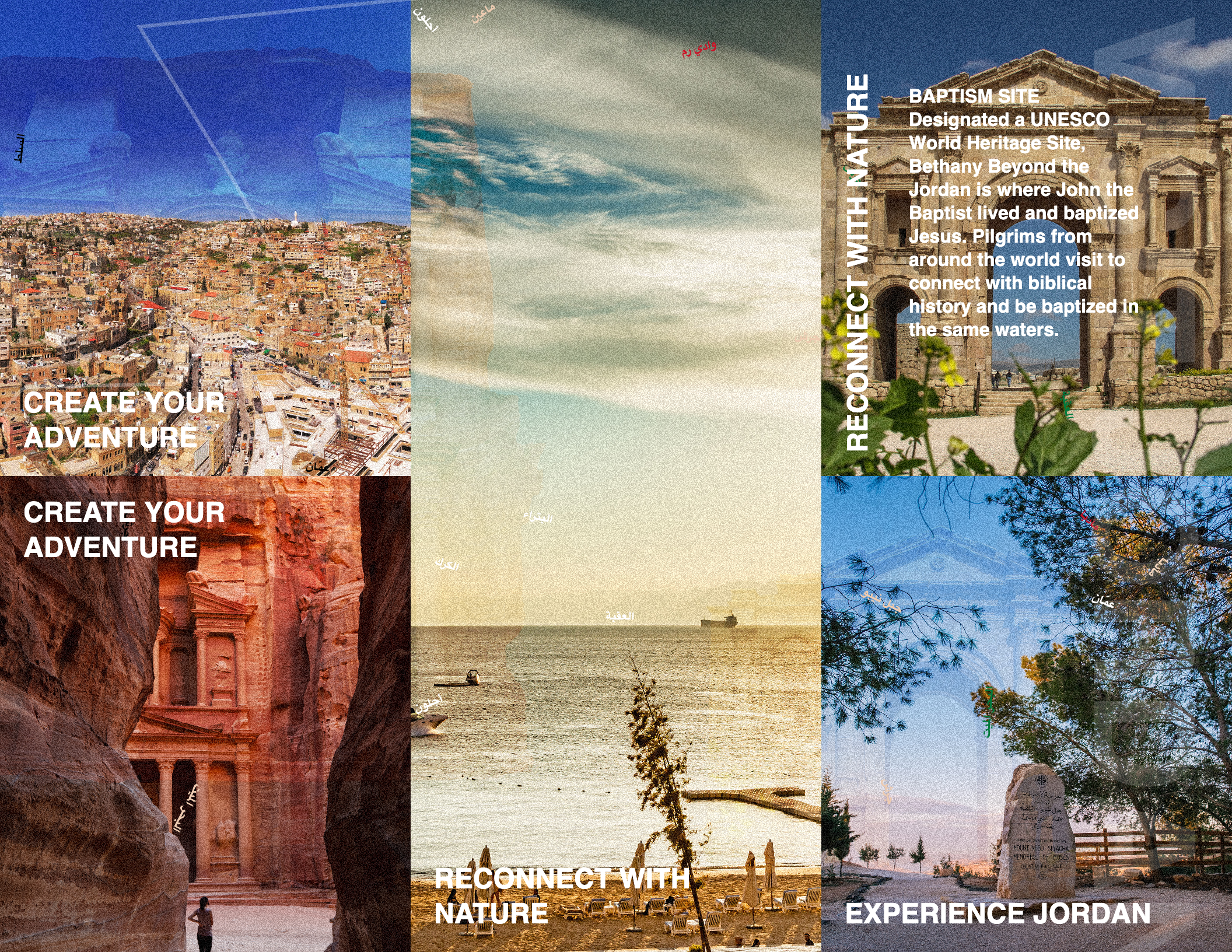
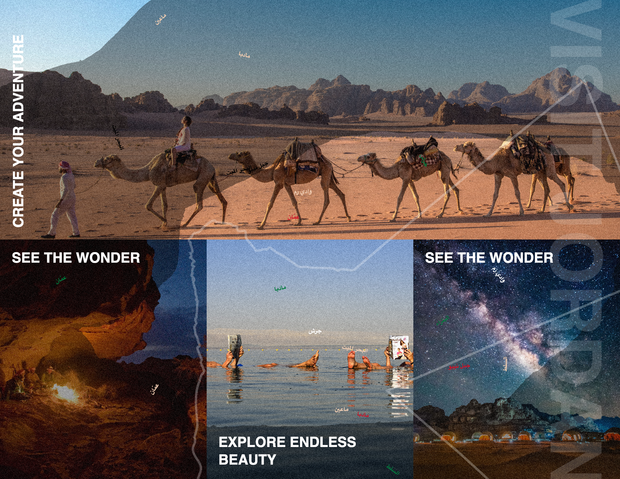
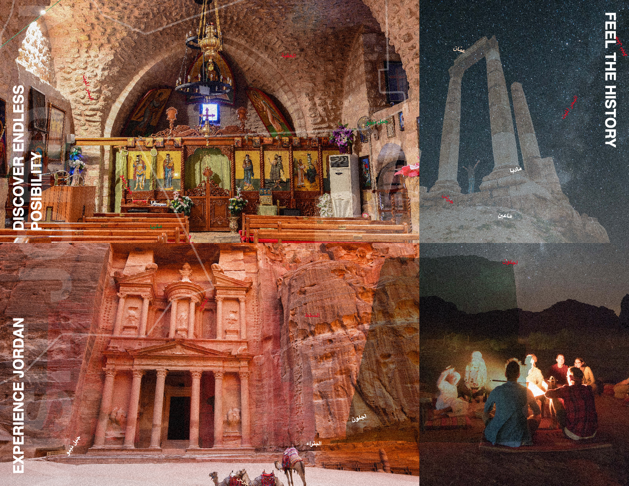
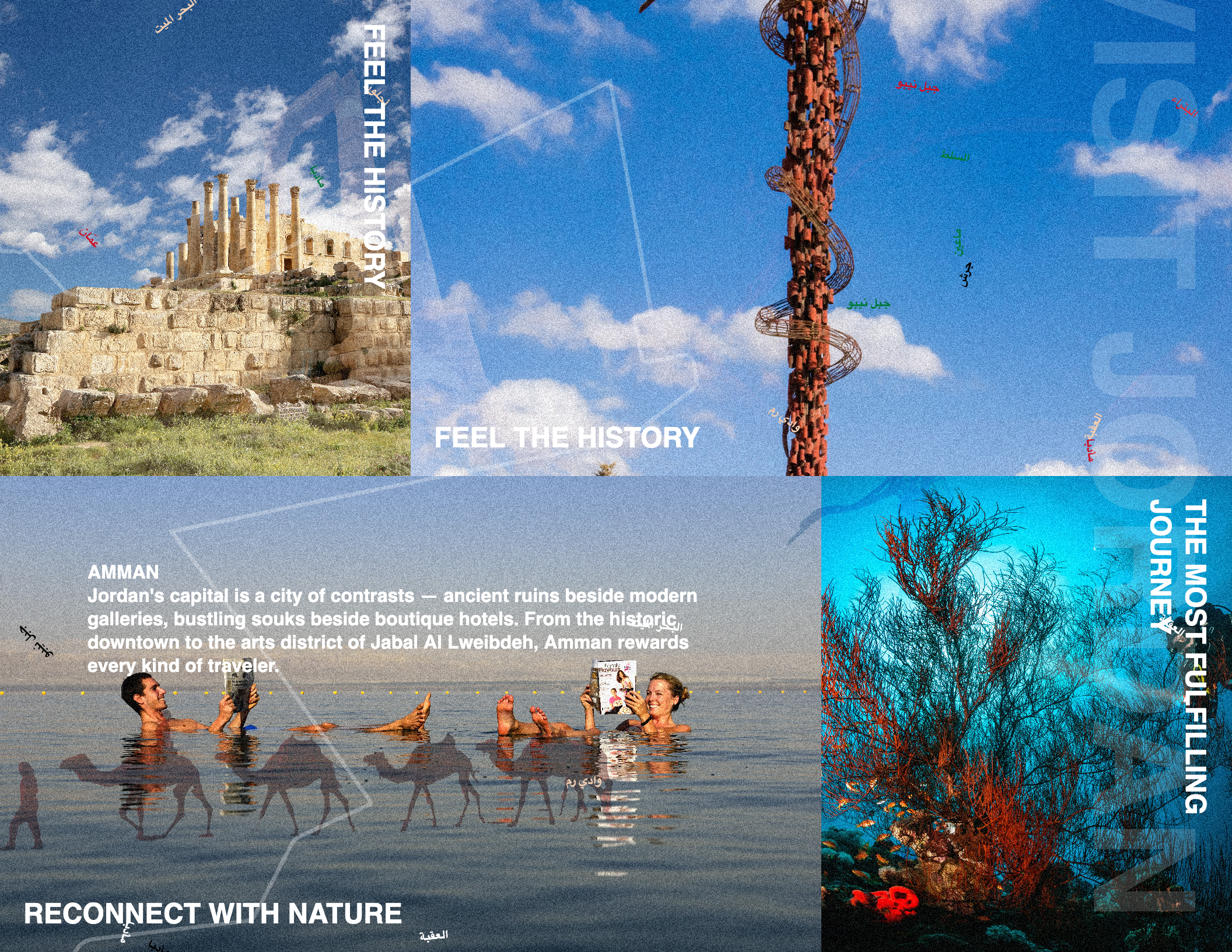
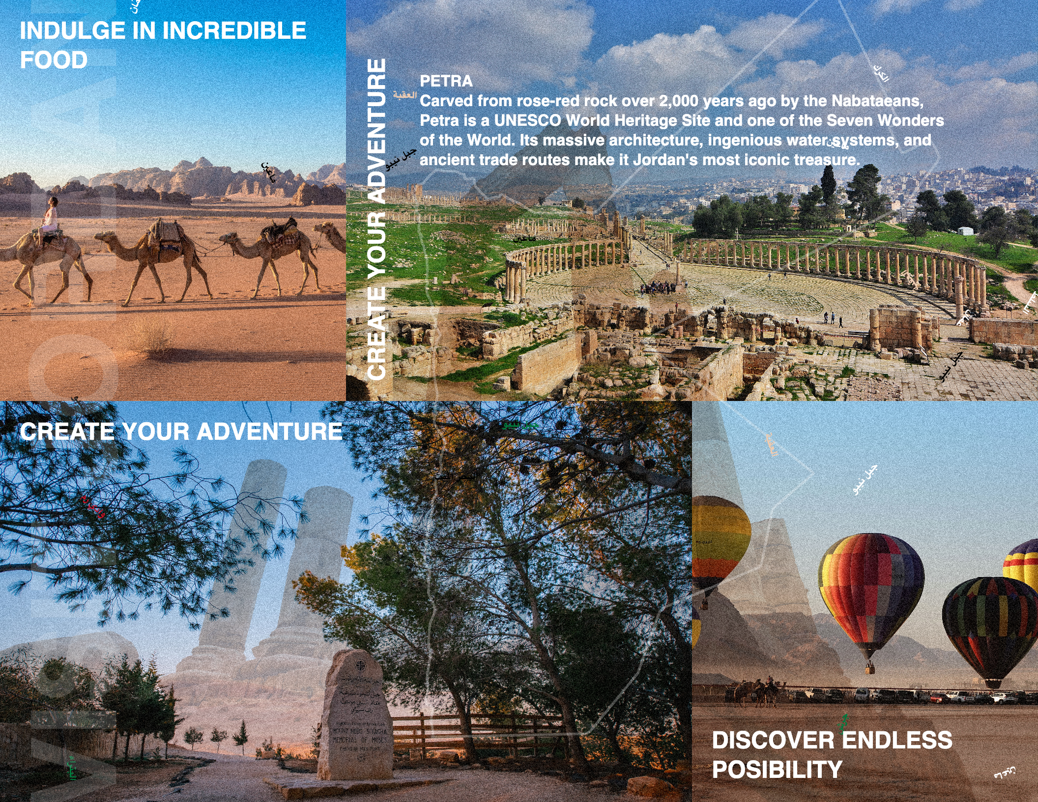
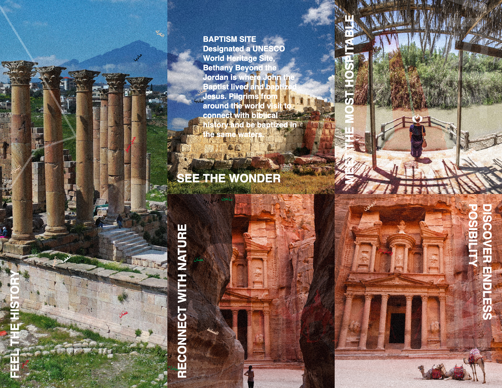
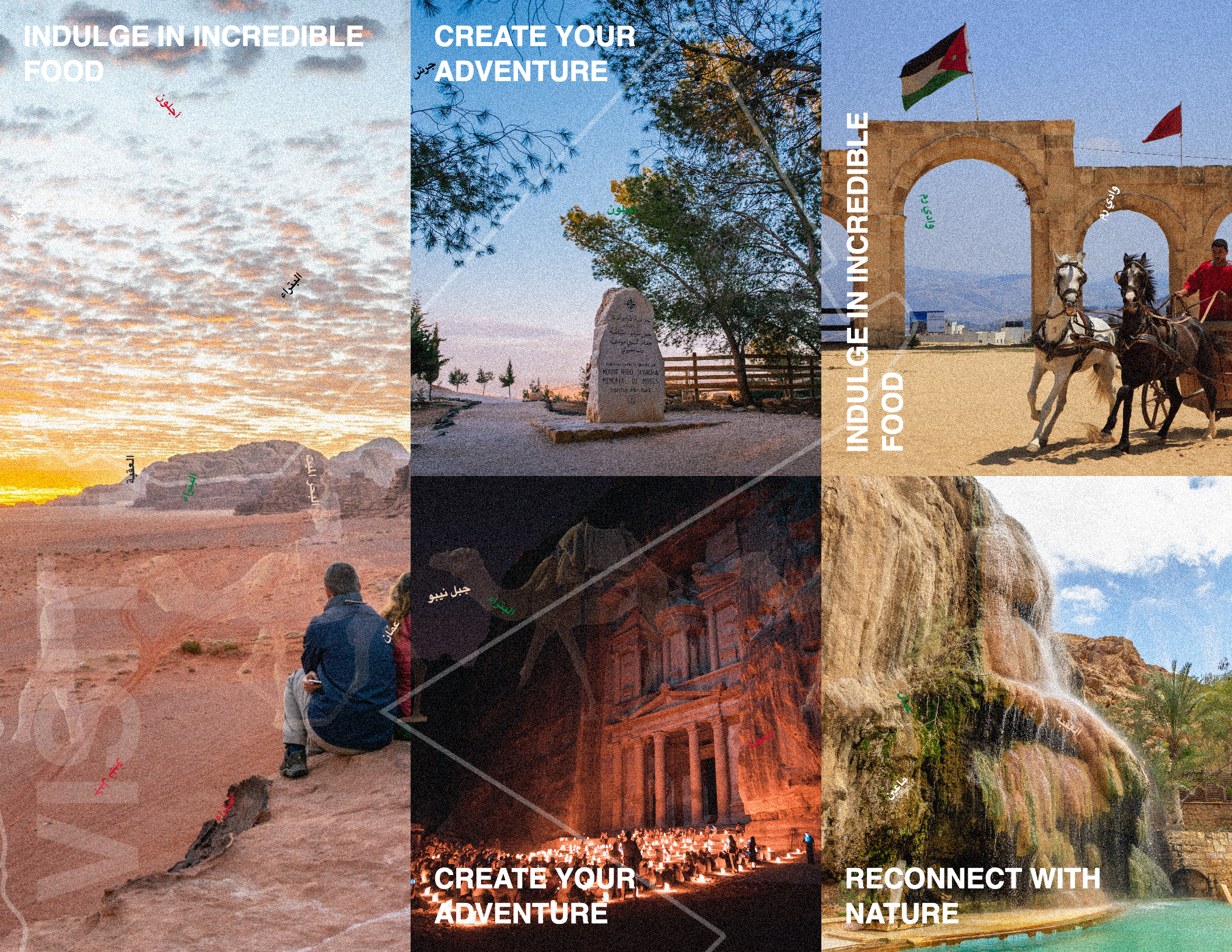
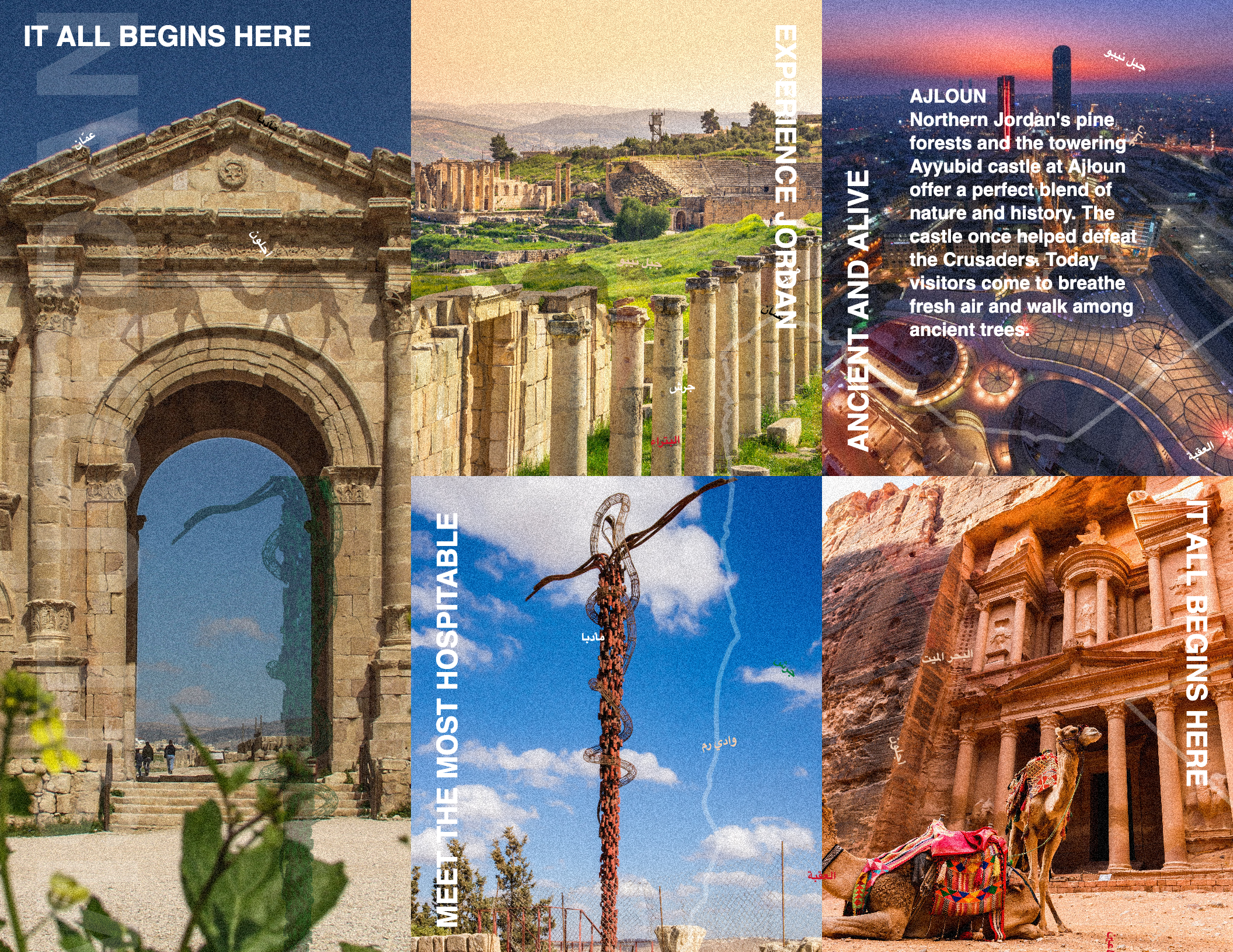
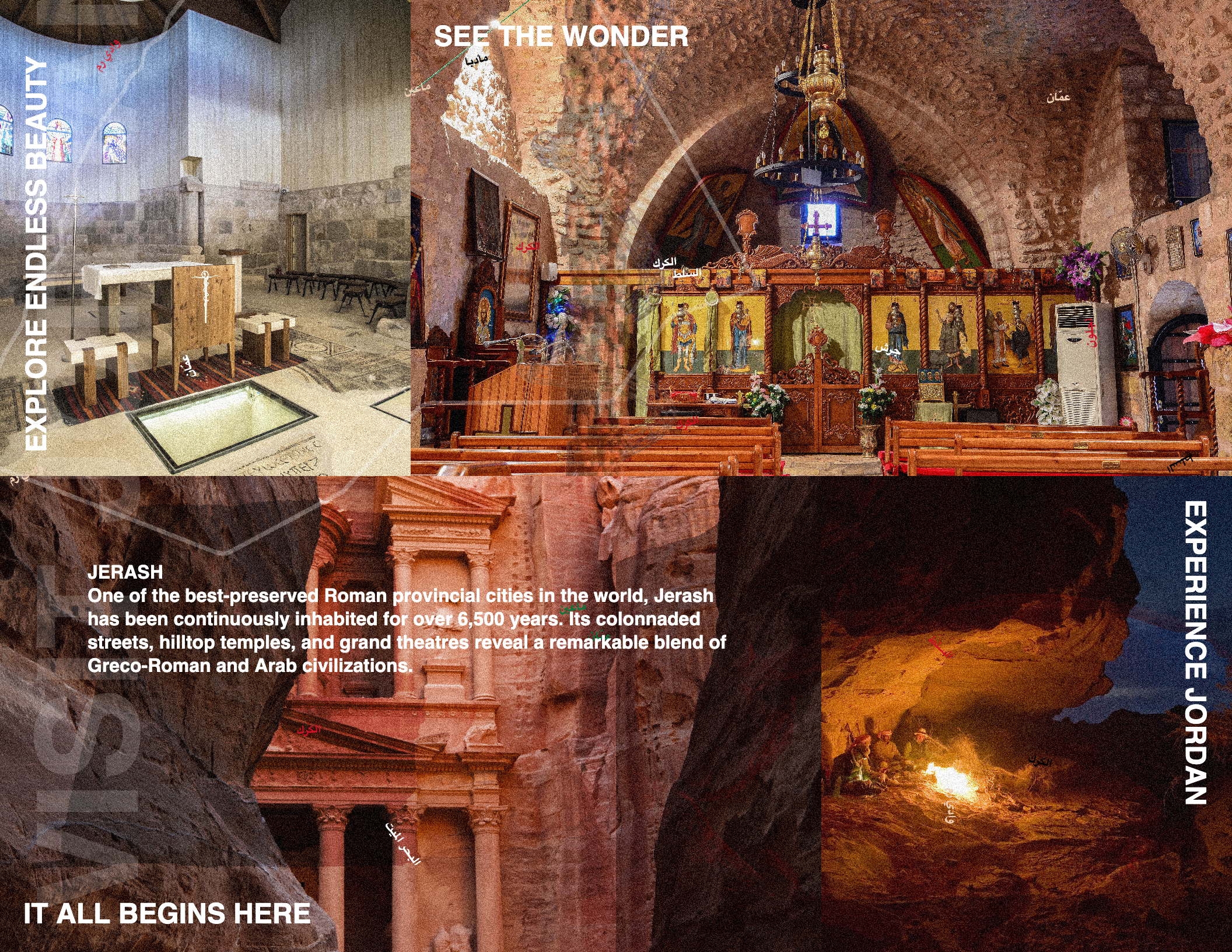
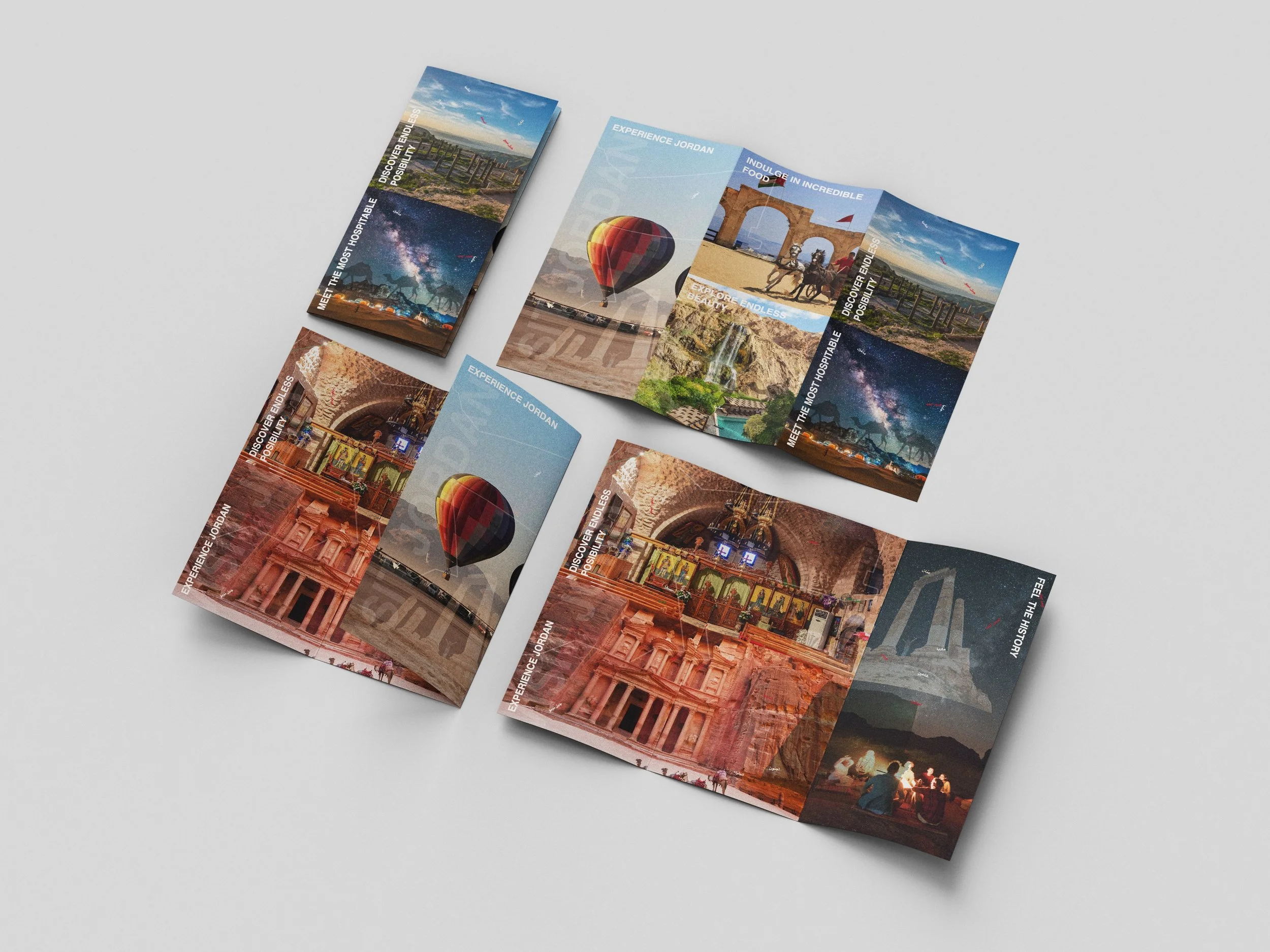
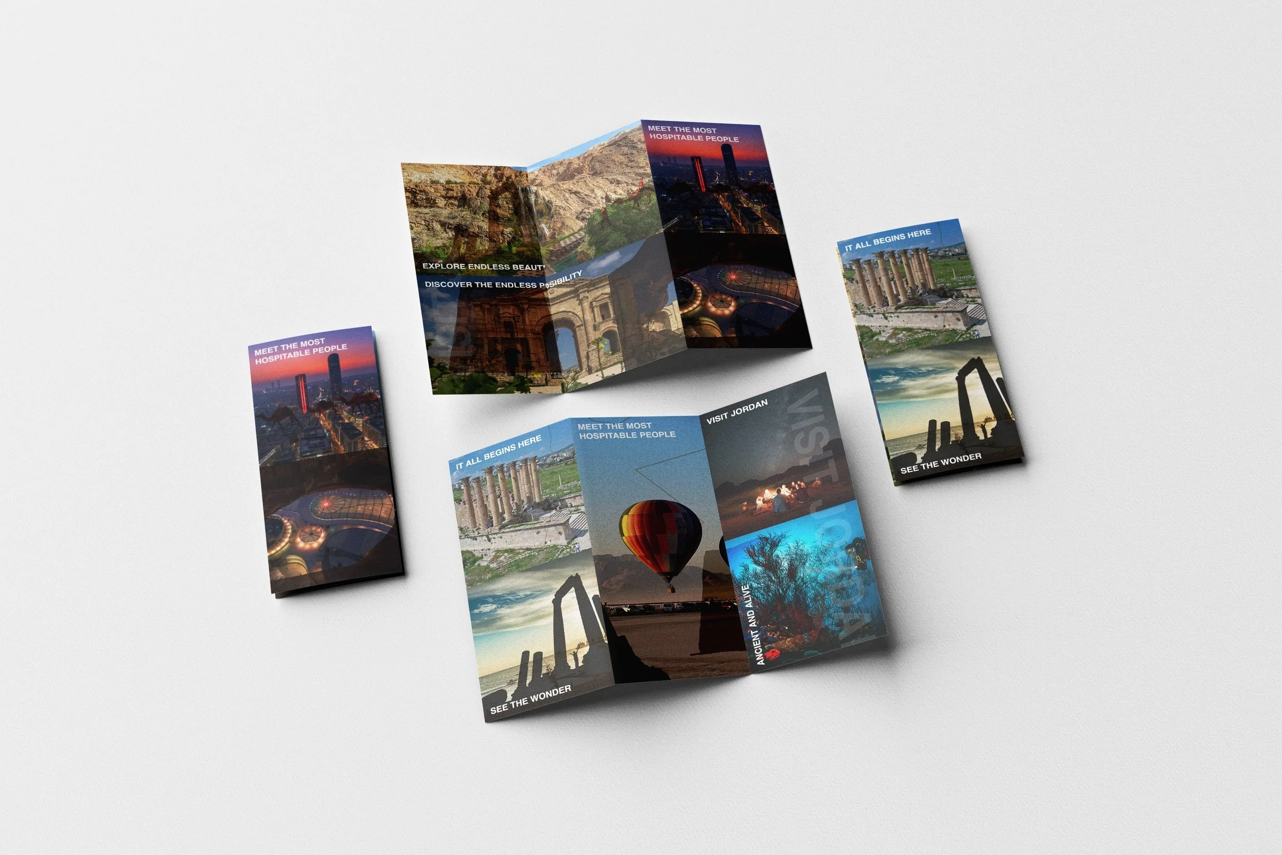
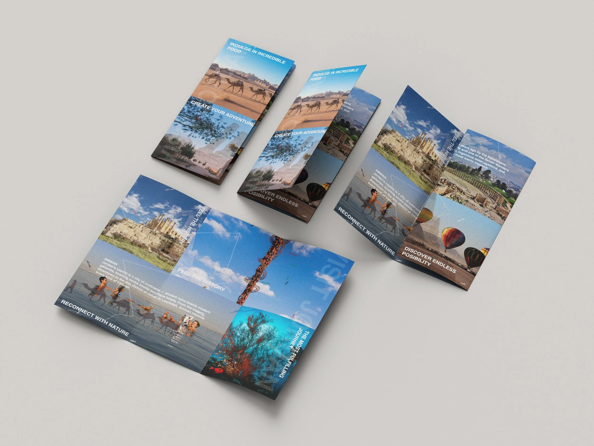
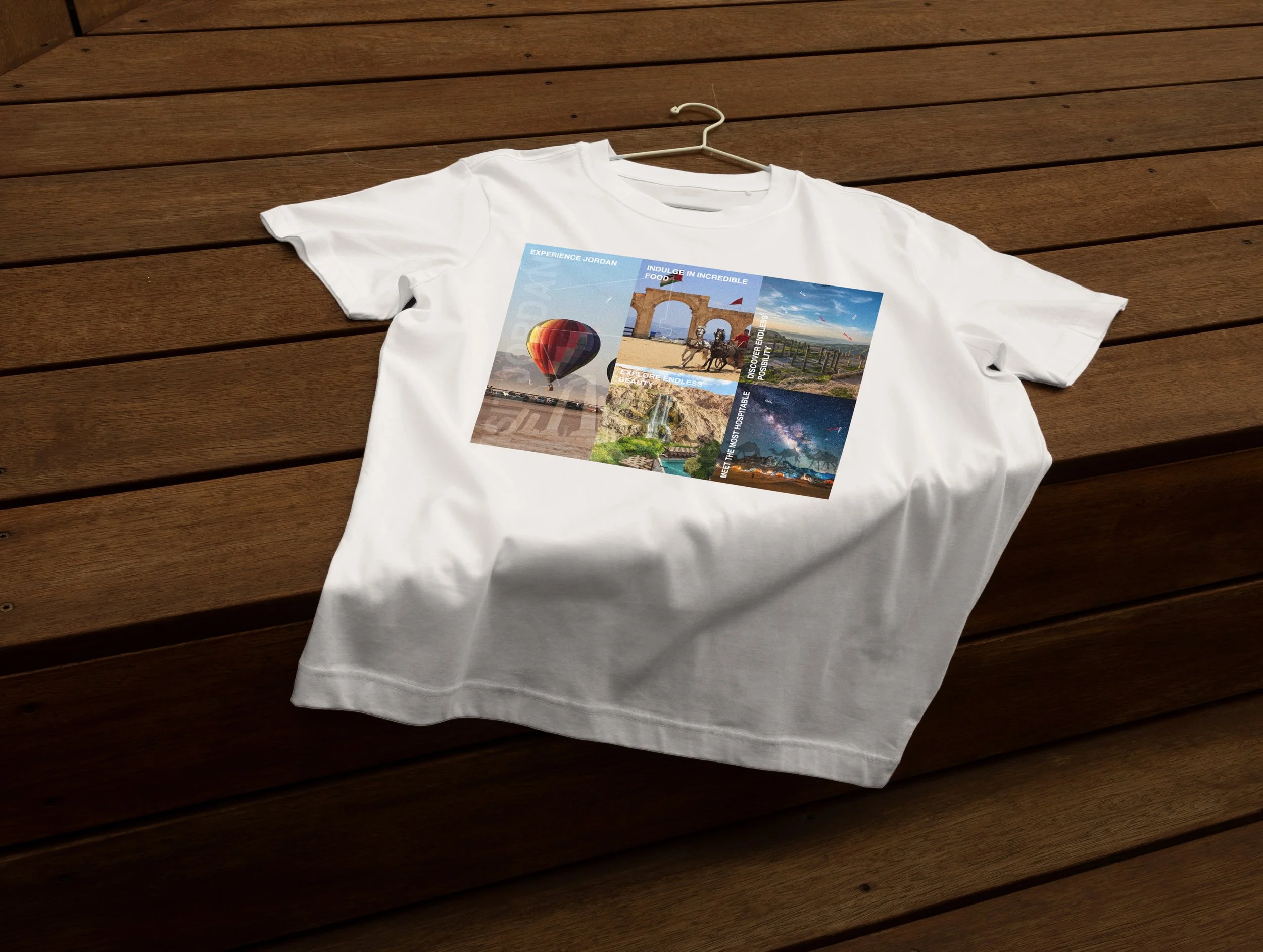
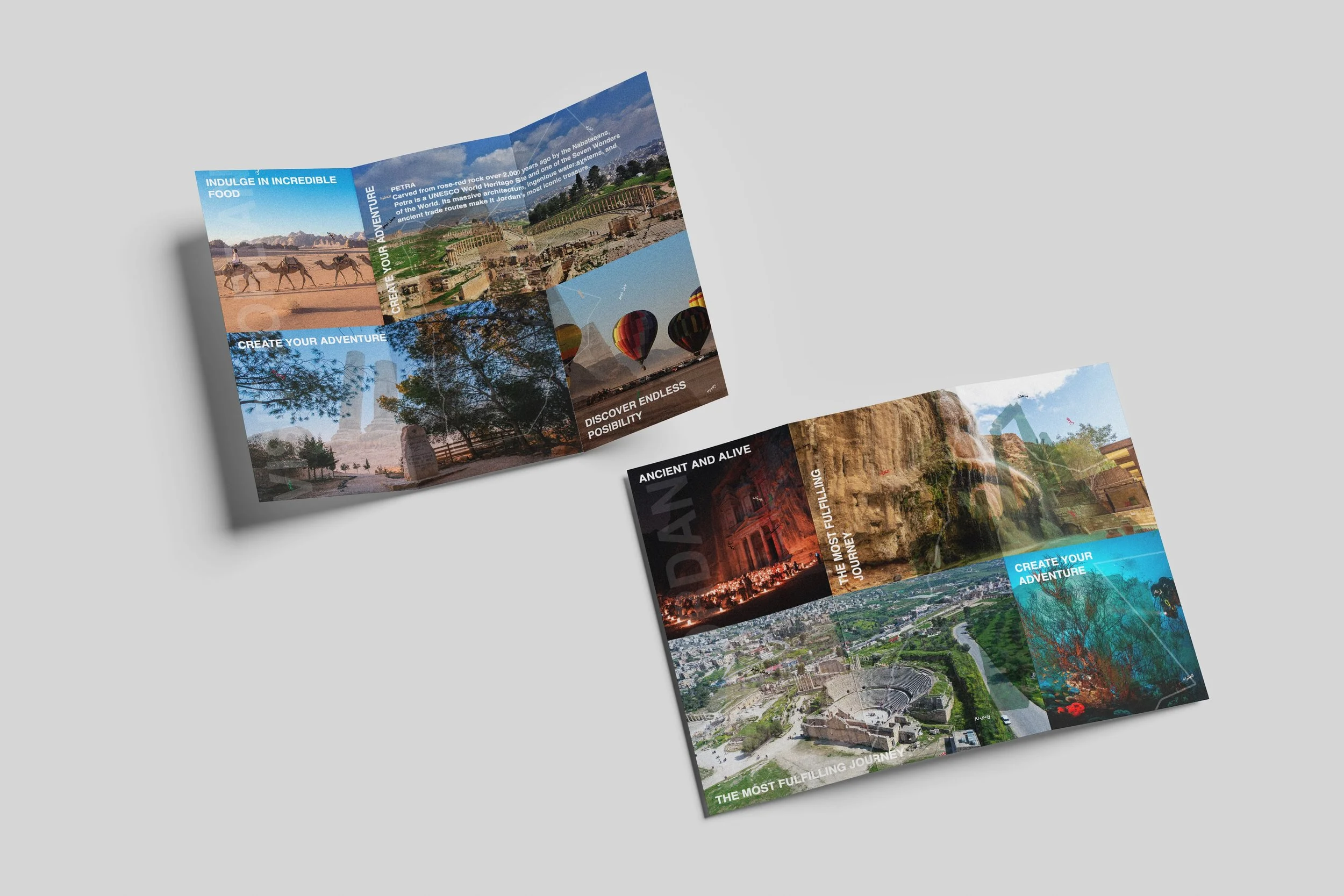
This sketch generates promotional brochures for Jordan, inspired by the official Visit Jordan tourism website. The system layers photographs, typography, and cultural information in the colors of the Jordanian flag to capture the country's beauty, history, and hospitality—and make people want to experience it for themselves.
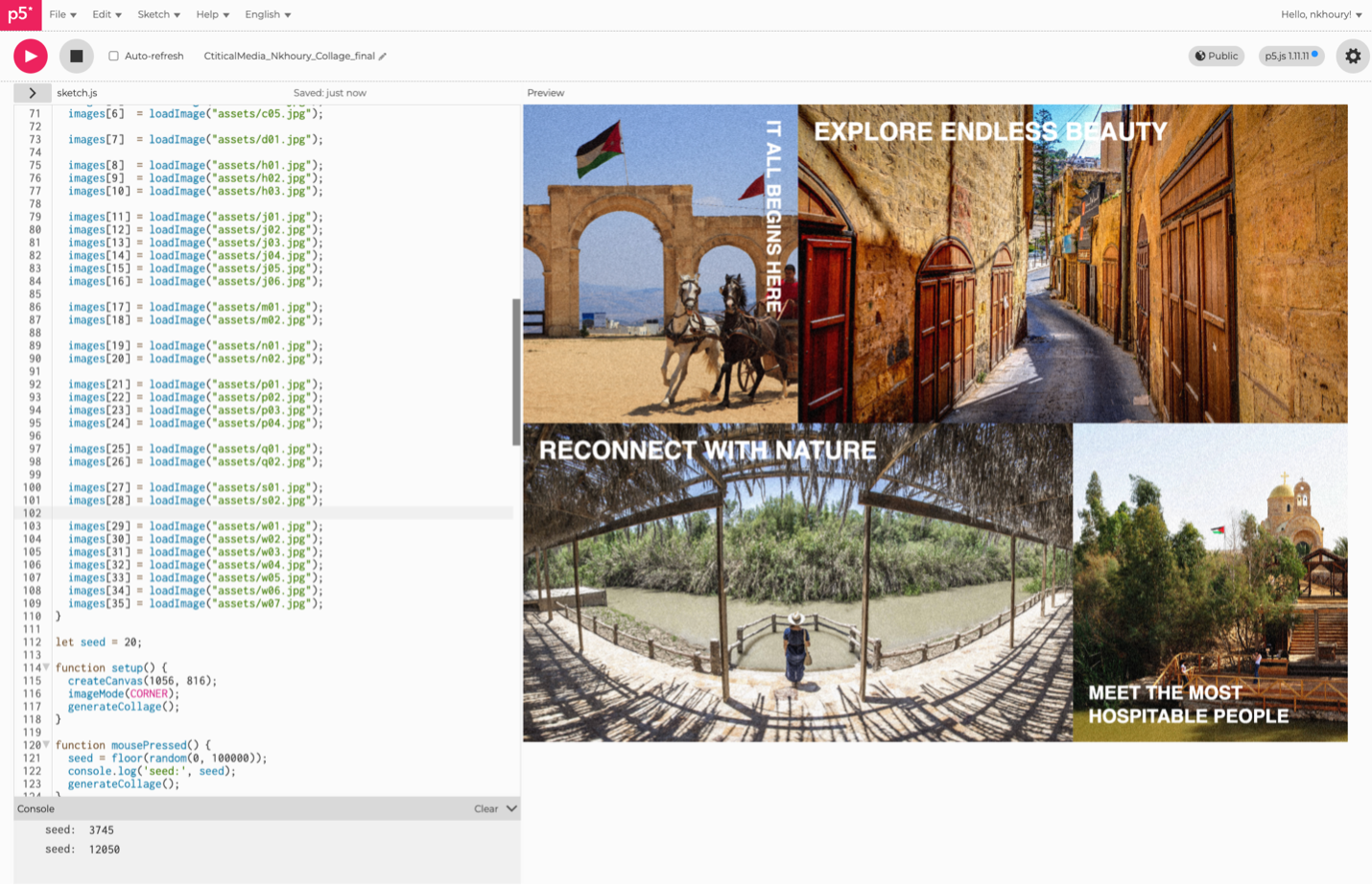
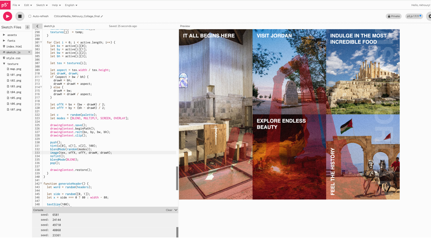
Every generation produces something new. Text, imagery, and texture shift with each click, but the grid never changes. Five layout configurations divide the canvas into cells that always respect the trifold structure, creating dynamic compositions within a fixed set of rules. The result is a system that always feels Jordanian — familiar, exciting, and alive — but never looks exactly the same twice.
Image Assets:
https://media.visitjordan.com/SearchResults.aspx?Keywords=&Categories=
Visit Jordan – The official website:
SYSTEM RULES
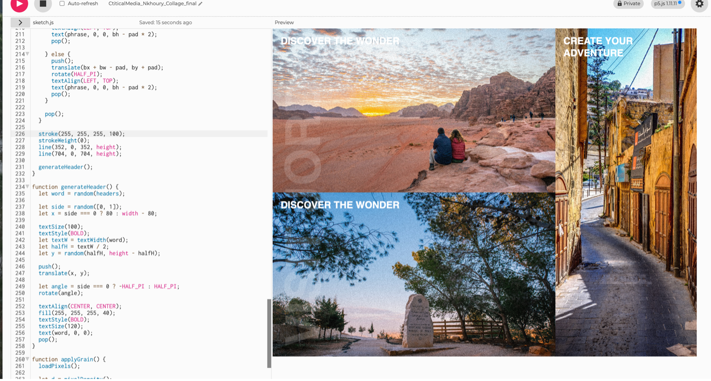
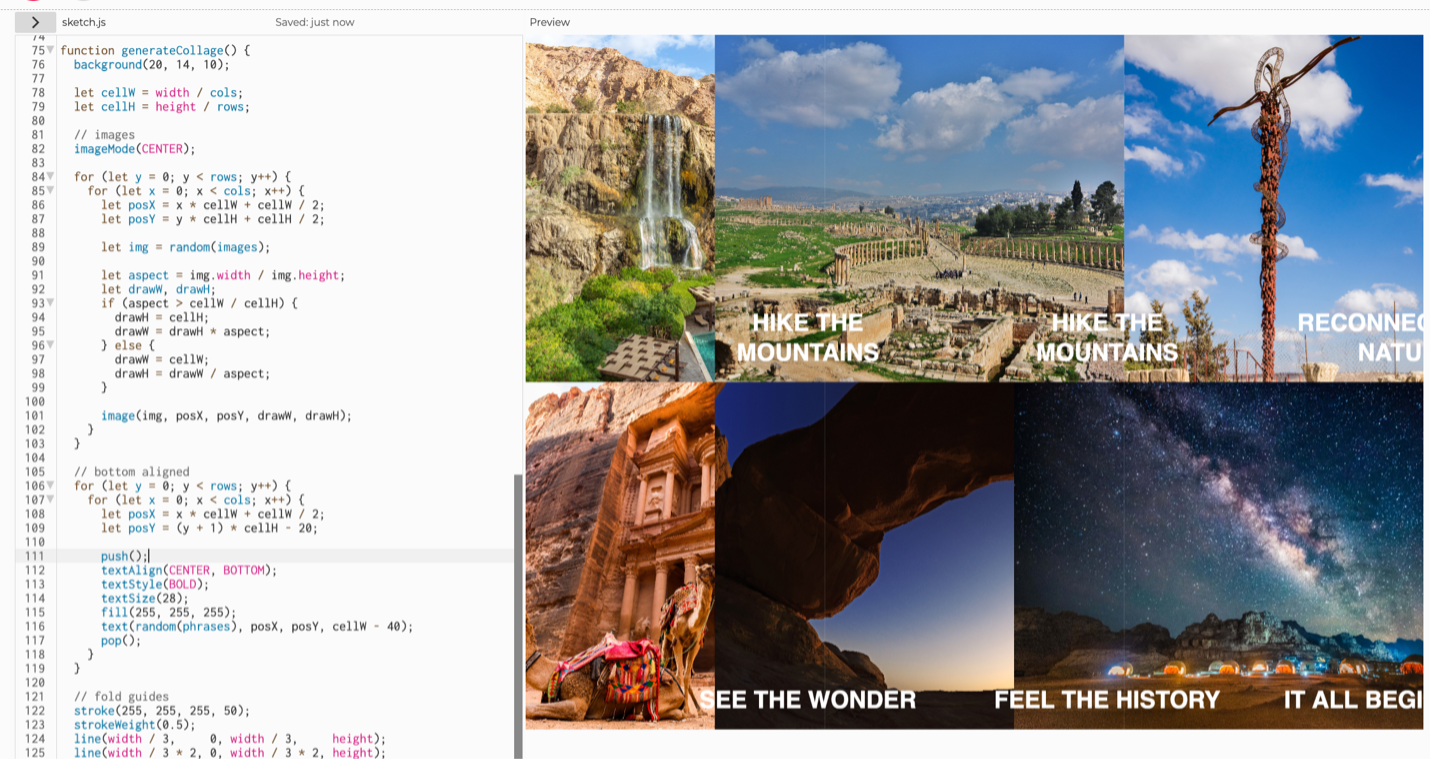
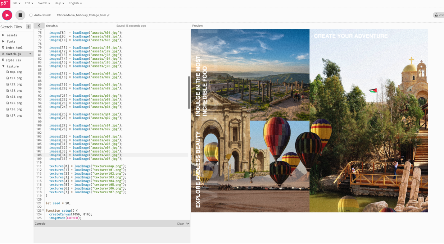
1. Photo Grid Images fill a 3×2 grid, spanning multiple cells but always edge-to-edge. Cropped, never stretched.
2. Text Phrases: Phrases snap to cell edges with padding. Never floating, rotating, or crossing cell boundaries.
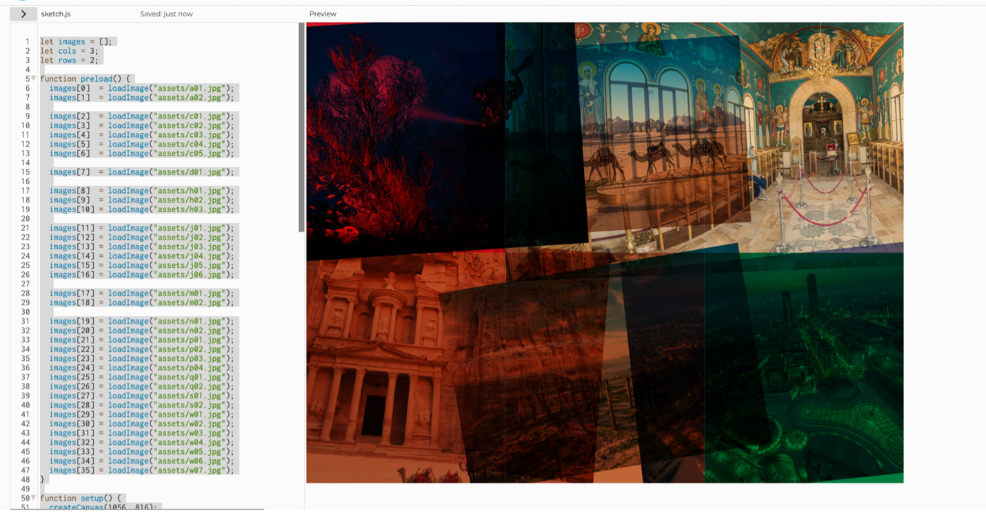
3. Cutout Grid: A 2×2 grid of background-removed images overlays the photos. Tinted in palette colors at reduced opacity.
4. "Visit Jordan" Header: Runs vertically, pinned to the far left or right edge only. Never centered.
5. Map of Jordan: Layered on top at a random position and cropped. Always recognizable.
6. Color Palette: Jordanian red, green, sand, black, and white.